BRIEF
Developing a Key Visual for a GTA-style event dedicated to the 20th anniversary of the company, while maintaining the corporate color.
PROCESS & RESULT
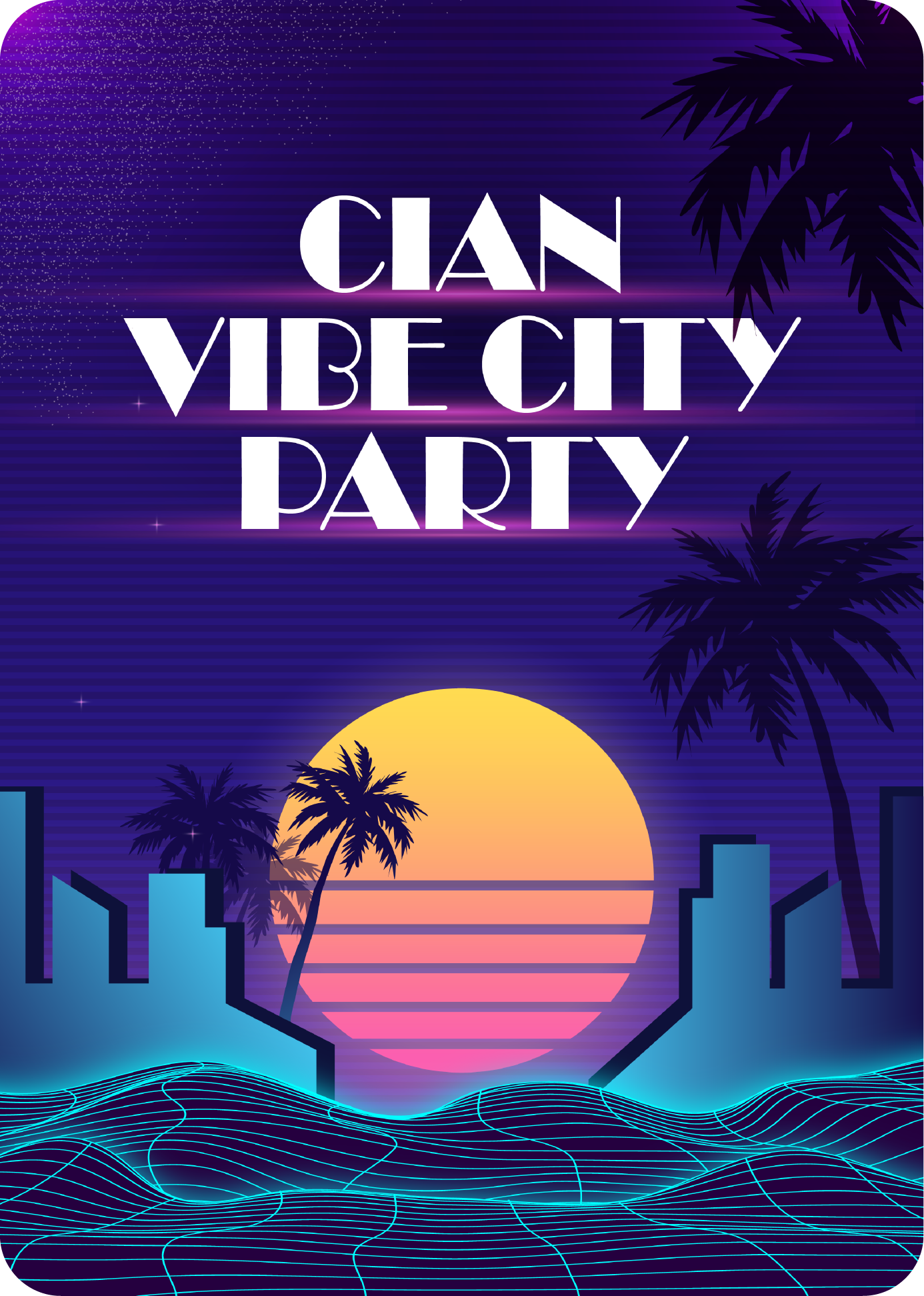
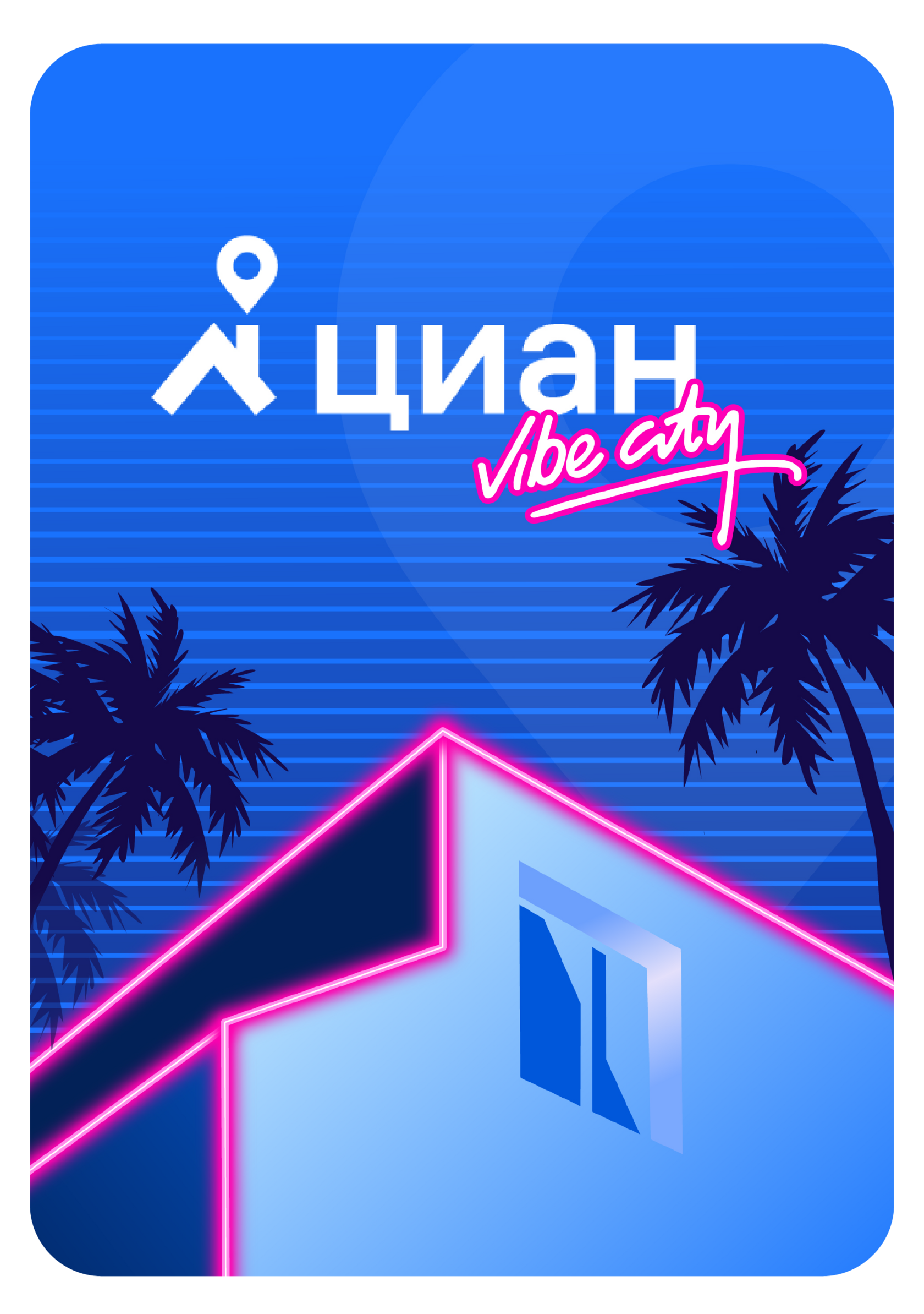
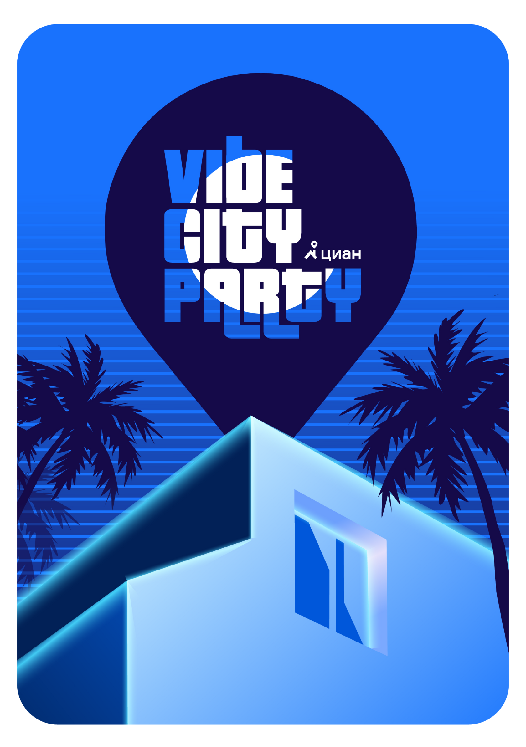
Creating a visual design for the 20th anniversary of CIAN, a real estate company, was a thrilling opportunity to blend nostalgia, creativity, and brand identity. Inspired by the vibrant aesthetic of «GTA Vice City» the theme was reimagined as «Vibe City» perfectly aligning with Cian's ethos and the celebratory spirit of the occasion.
The process began with Key Visual to develop a cohesive visual identity that captured the essence of Vibe City. Drawing from the game's retro-futuristic style and the allure of 1980s Miami, the design elements were carefully curated to evoke a sense of nostalgia and excitement.
The process began with Key Visual to develop a cohesive visual identity that captured the essence of Vibe City. Drawing from the game's retro-futuristic style and the allure of 1980s Miami, the design elements were carefully curated to evoke a sense of nostalgia and excitement.
CORPORATE IDENTITY OF CIAN

Font: Grtsk Peta
Logo:

Colors:


Cian is a service for renting, buying and valuing real estate in Russia.
Working on key visual, options of ideas:
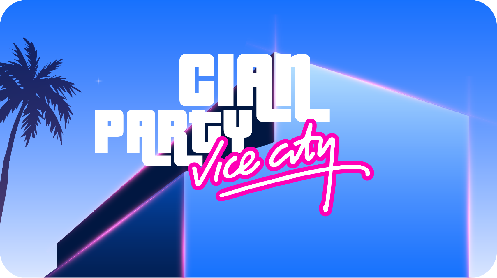
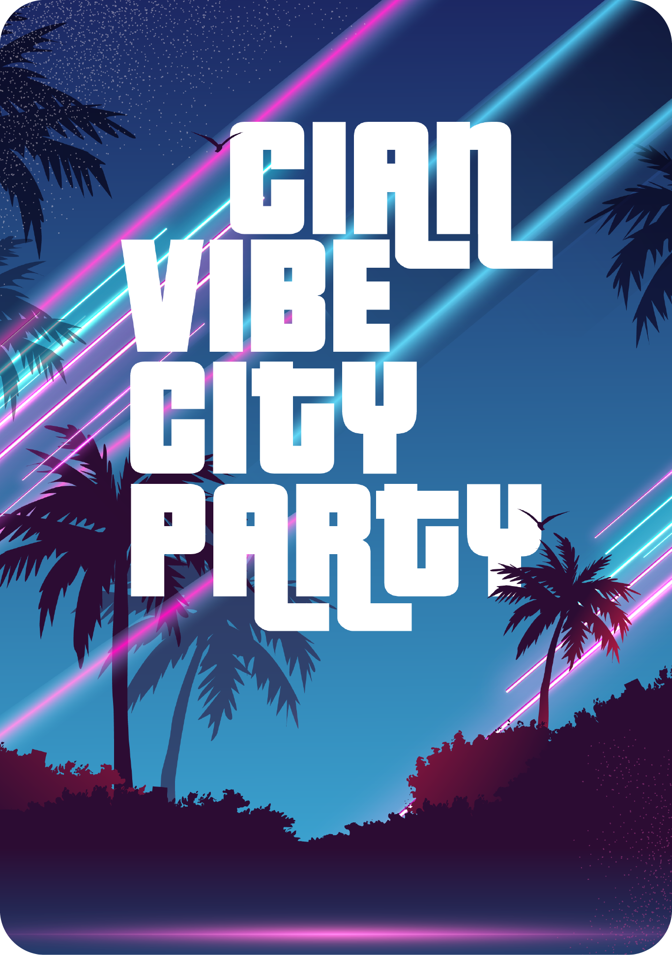


Final Key Visual
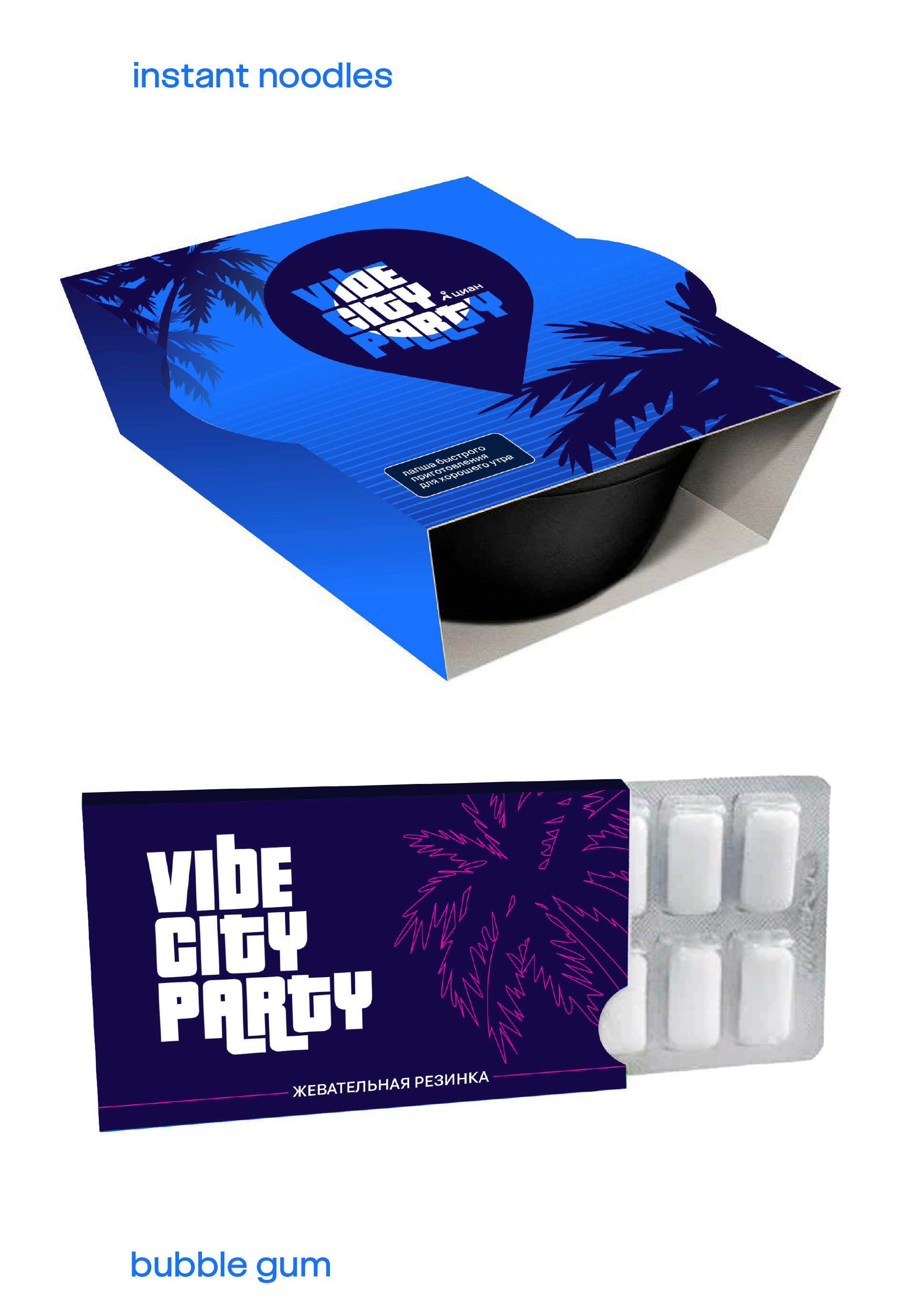
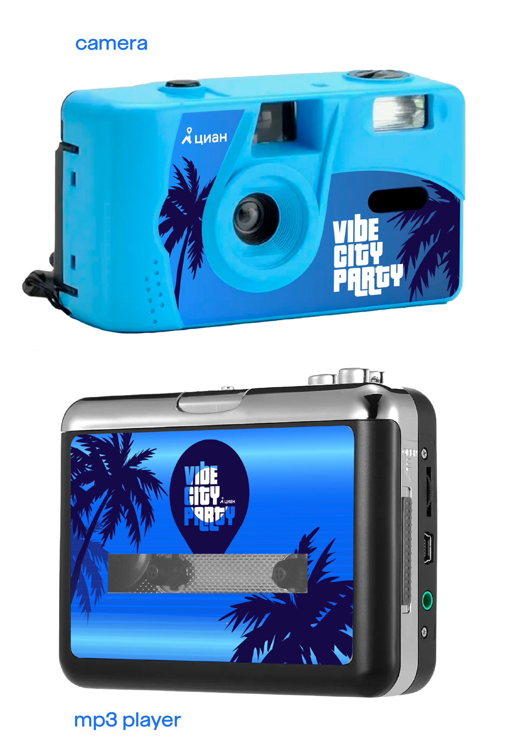
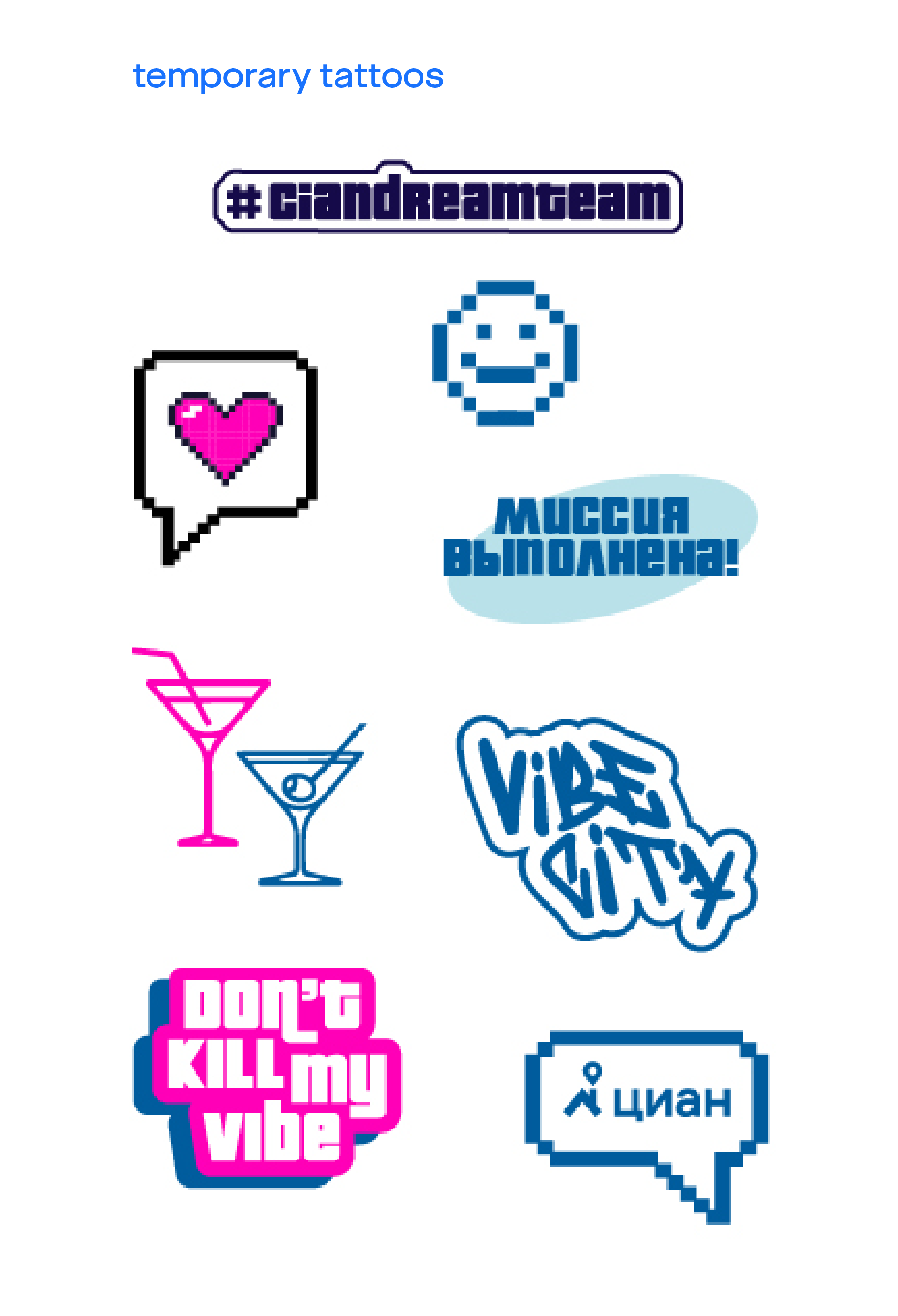
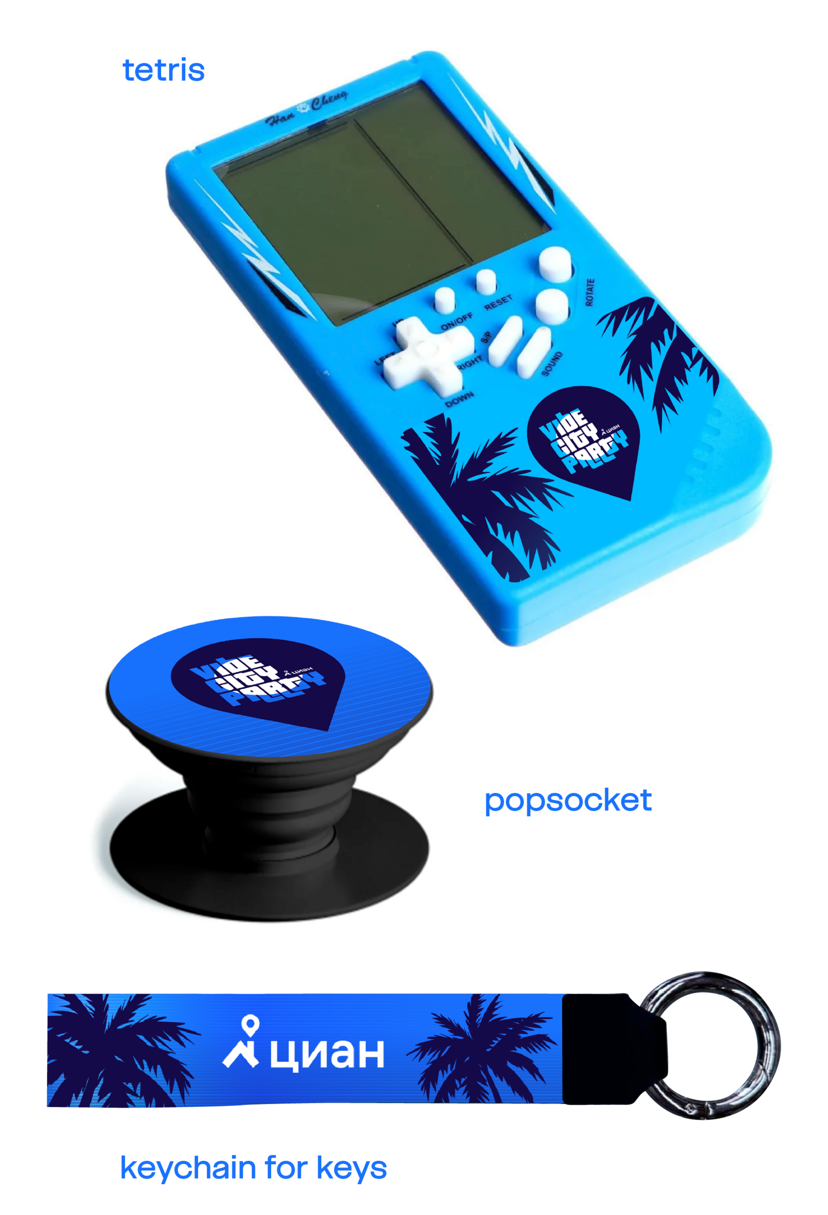
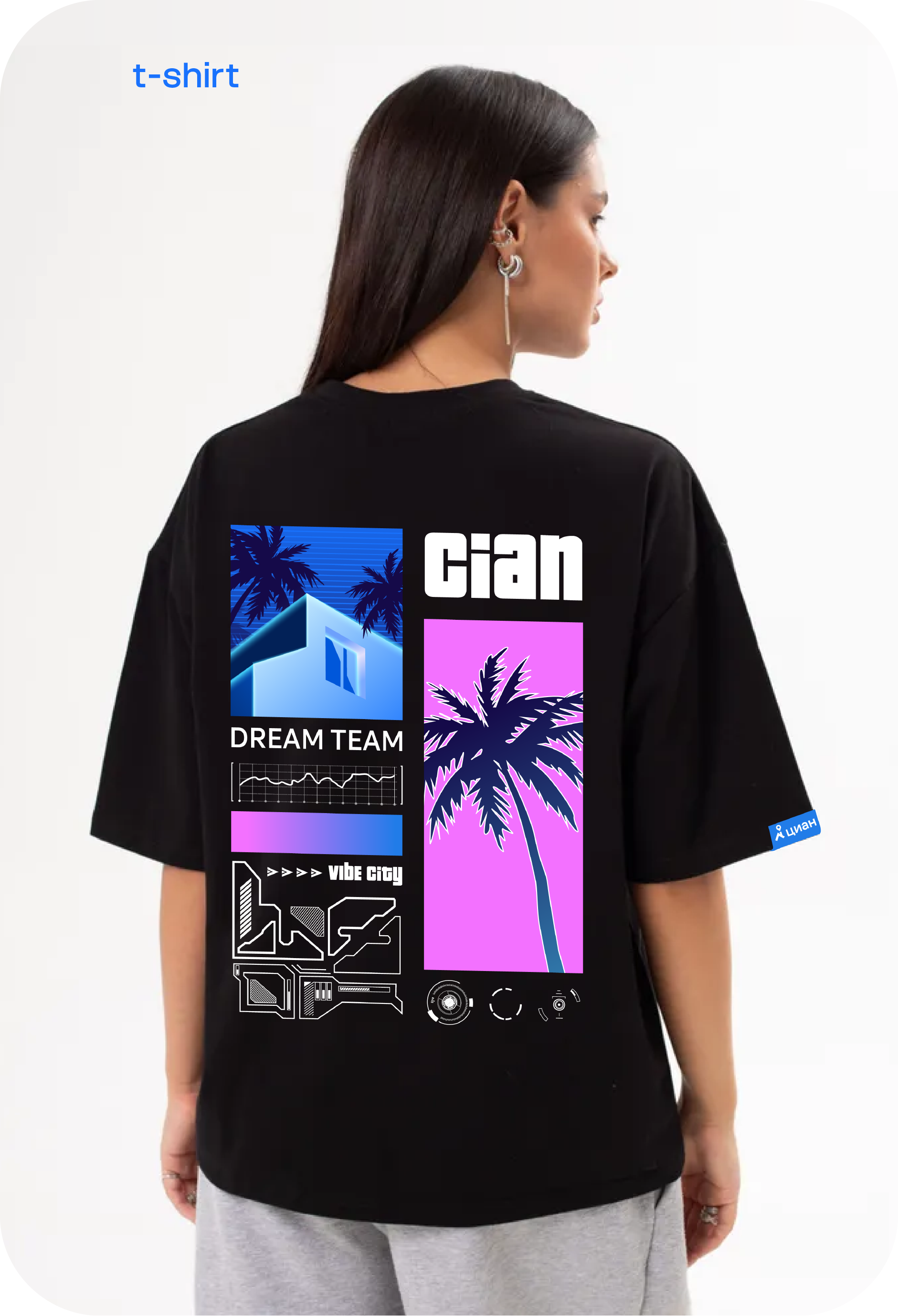
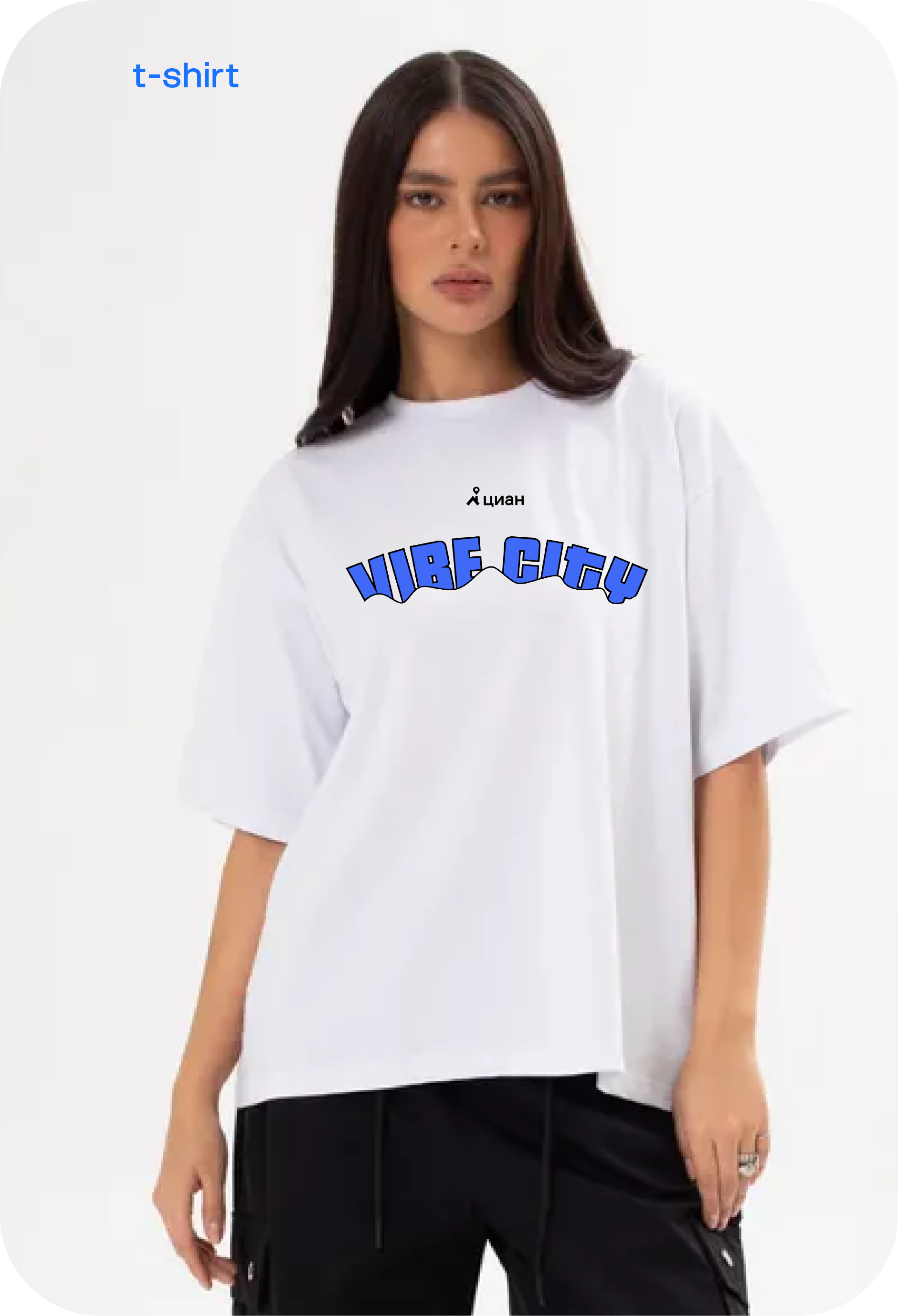
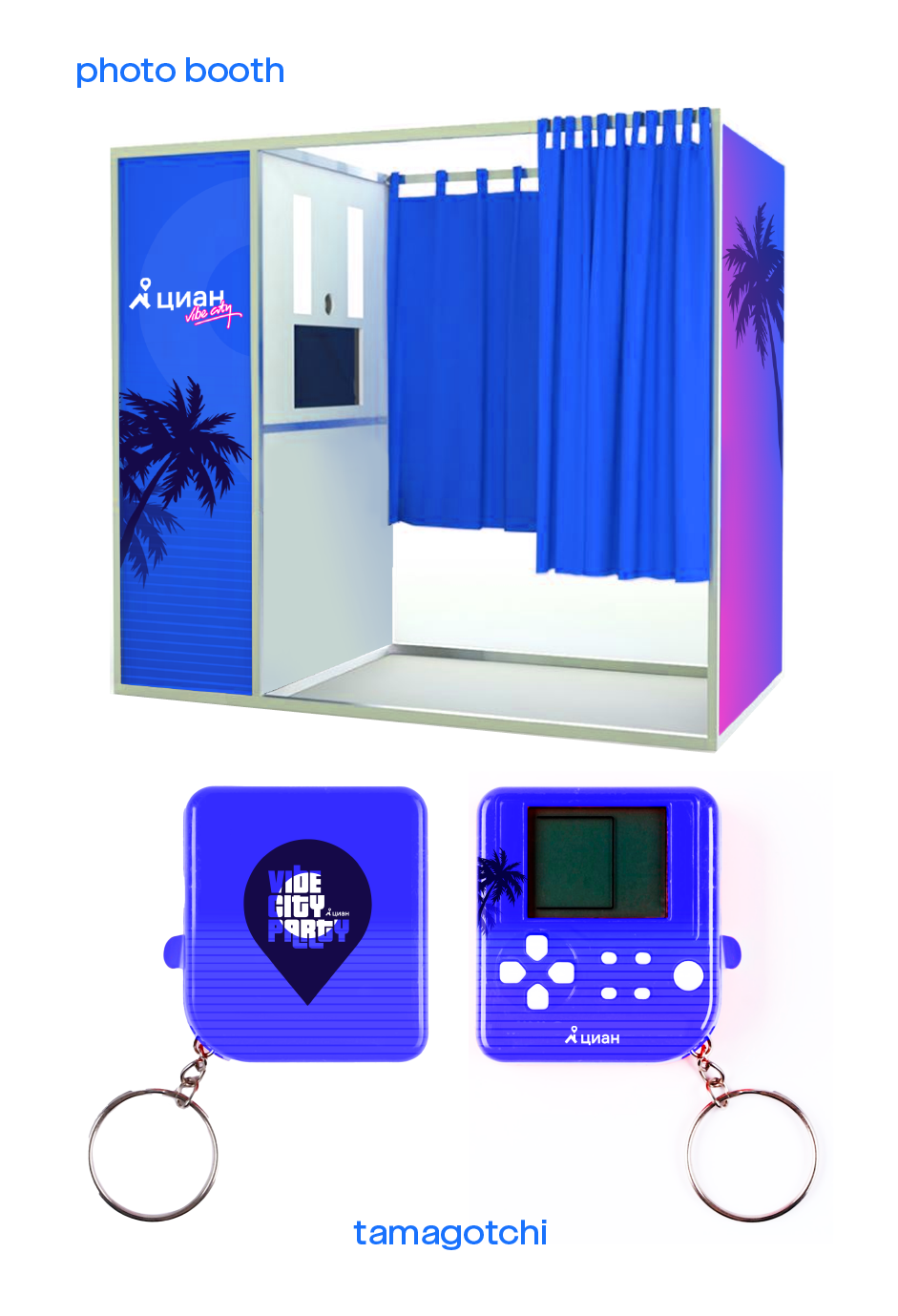
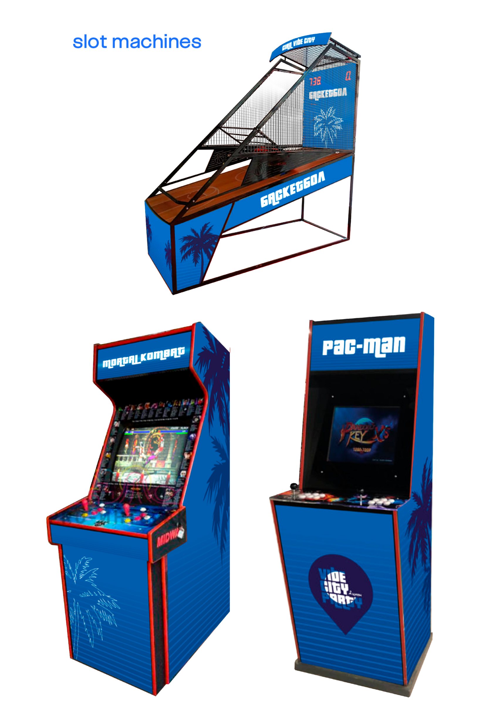
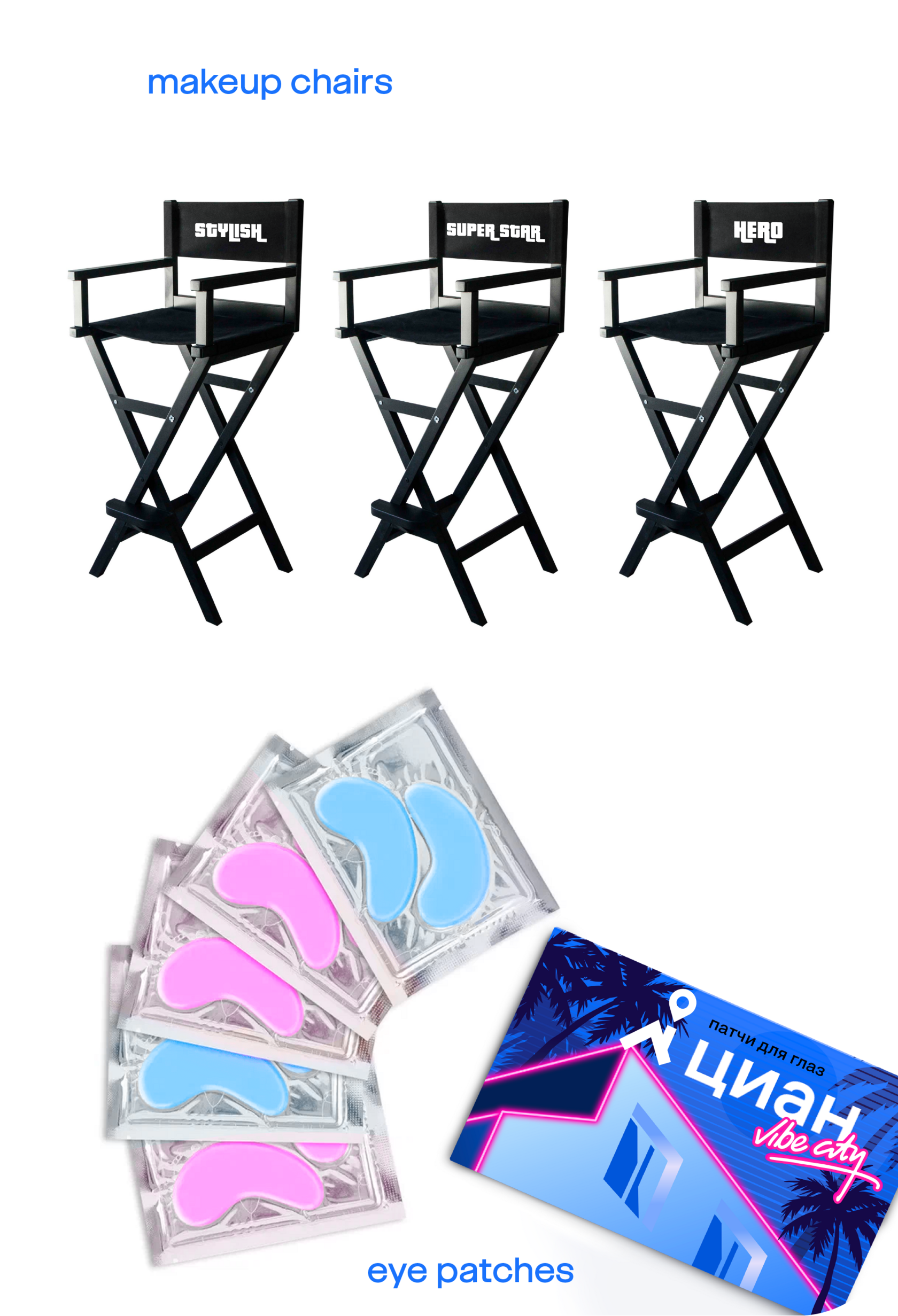
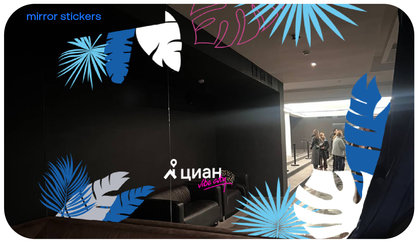
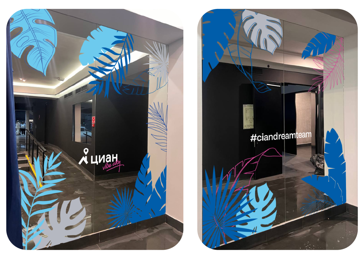
Additional branding elements and accessories played a crucial role in turning the event into an exciting experience. From specially designed tattoos, stickers, designs for slot machines, neon-lit signage, to branded goods such as T-shirts, tetris.
Every detail has been carefully thought out to transport guests to the neon-lit streets of Vibe City.
Every detail has been carefully thought out to transport guests to the neon-lit streets of Vibe City.


The result was a visually stunning event that exceeded expectations and left a lasting impression on attendees. As guests entered the venue, they were greeted by an atmosphere with vibrant colors, retro décor, and synthwave music setting the stage for an unforgettable celebration.